
Let’s get the fine print out of the way first. “Out” doesn’t mean ugly, and “in” doesn’t mean you have to do anything about it. Trends simply show where the momentum is: what designers are specifying, what paint brands are betting their year on, and what homeowners keep asking for.
For 2026, that momentum points in one direction. Warmth is in. Personality is in. Anything cold, glossy, matched, or staged is on its way out.
Below you’ll find 45 trends: 27 gaining ground and 18 losing it. Each comes with the practical version, meaning how it looks in a real room and where people tend to go too far. Skip to the sections that fit your home, and if you want more background on the big-picture direction, designers’ 2026 trend predictions from Dezeen are a good companion read.
What’s In
Color
1. Warm earth tones as the new neutral base. Khaki, clay, caramel, terracotta, and warm greige are replacing cool gray as the default backdrop. The paint industry backed this with its own picks: Sherwin-Williams named Universal Khaki (SW 6150) its 2026 Color of the Year, and Dutch Boy chose a creamy beige, Melodious Ivory (313-2DB). If your gray rooms feel flat instead of calm, start here.
2. Color drenching. Paint the walls, trim, and often the ceiling in one rich color, and the room feels wrapped in it. Benjamin Moore’s 2026 pick, Silhouette (AF-655), an espresso brown with charcoal notes, suits the technique well. Try it first in a powder room or small bedroom, where a deep color carries the most impact and the least risk.
3. Chocolate brown and burgundy as lead colors. In 1stDibs’ ninth annual survey of 468 design professionals, 33% named chocolate brown a top color for 2026, up from 17% in 2022. Burgundy also ranked among the favorites, with 21% in the survey’s 2026 results. Use them as the deep anchor in a warm room: a burgundy chair, a chocolate sofa, brown velvet cushions. Two strong pieces are plenty, because a whole room of either gets heavy fast.
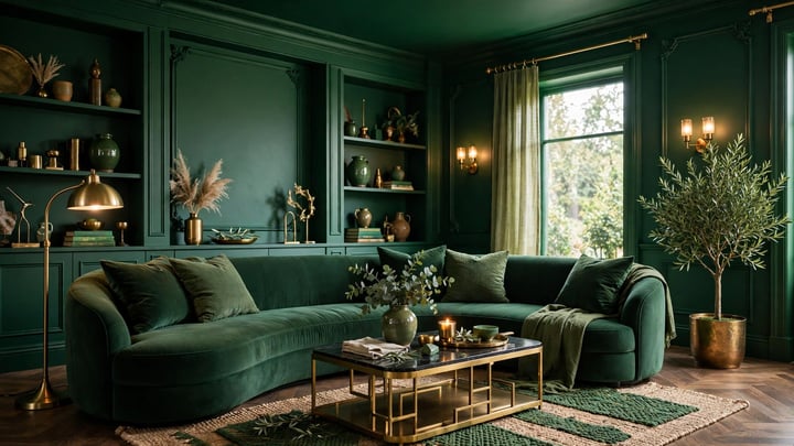
4. Smoky greens. Behr’s 2026 Color of the Year is Hidden Gem (N430-6A), a smoky jade, and Valspar picked Warm Eucalyptus (8004-28F), a muted gray-green. Green has become a near-neutral: think kitchen cabinets, bathroom walls, bedroom textiles. It sits happily next to the warm woods and brass that run through this whole list.
5. Warm white, not bright white. Pantone’s 2026 Color of the Year is Cloud Dancer (11-4201), a soft white that Pantone describes as a calming influence. It shows where white is heading: creamy and quiet, never blue-white or clinical. If you’re repainting a white room, going one step warmer changes the feel more than most furniture swaps.
6. Earthy reds. Glidden’s 2026 pick, Warm Mahogany (PPG1060-7), is a grounded red-brown, and oxblood and brick tones keep turning up as accents. The safe way in is textiles plus one painted piece: the back of a bookcase, a door, a sideboard. Reds have the shortest distance between “rich” and “too much” of anything on this list.
7. Soft pastels as supporting accents. Butter yellow, pistachio, cornflower blue, and baby pink are showing up as the light counterpoint inside warm, deep rooms, usually in cushions, bedding, art, or a single chair. Think of them as seasoning, not the main dish. A pastel room reads like a nursery; a burgundy room with one butter-yellow cushion reads considered.
Materials and Texture
8. Limewash and plaster walls. Matte, cloudy, hand-worked finishes give flat paint the one thing it can’t fake: movement. Limewash and Roman clay shift with the light through the day, which is why they pair so well with the warm palette. They’re also kind to older walls, where small imperfections become texture instead of flaws.

9. Dark woods returning. Walnut and other deep woods are back after a decade of pale oak, in softer, more modern shapes. A single dark piece, such as a coffee table, sideboard, or shelving unit, gives a warm neutral room the contrast it needs to avoid going bland. Mixing dark and light wood is fine. Matching every wood in the room isn’t the goal.
10. Ribbed and reeded detail. Fluted wood panels, reeded glass, ribbed cabinet fronts, and textured hardware add small-scale interest to plain furniture without pattern or color. Reeded glass cabinet doors are my favorite kitchen version: they hide clutter better than clear glass and feel softer than solid fronts.
11. Antique and tumbled brass. Warm metals lead, and the preferred finish is aged rather than shiny: tumbled antique brass, brushed bronze, anything that will patina over time. Chrome hasn’t vanished, and some designers use it as a crisp accent against warm tones. As the default metal for a whole room, though, it has been overtaken.
12. Velvet and rich upholstery texture. Velvet, heavy twill, ribbed fabrics, and high-pile wool are the upholstery direction, part of a wider shift to dimensional neutrals: rooms that stay in one color family but layer how every surface feels. That’s the practical version of minimalism for 2026. The palette can be quiet as long as the textures aren’t.
13. Patterned rugs. Plain natural-fiber rugs are giving ground to patterned ones, from vintage-look Persian and Turkish styles to designs that pull the room’s colors together on the floor. If a room feels unfinished and everything else is in place, the rug is usually the missing layer. Buy the bigger size (see trend 39).
Furniture and Form
14. Curved and sculptural furniture. Rounded sofas, arched mirrors, oval and round tables, chairs with softened backs: curves are the antidote to a decade of boxy rooms. According to a 1stDibs-based report, 43% of designers named curvy and irregularly shaped furniture as a 2026 trend. They’re practical in small spaces, too, since a round table seats the same people with easier traffic flow. One curved piece per room changes the geometry; five start fighting each other.

15. Vintage and antique case pieces. Freestanding vintage sideboards, armoires, and chests are being chosen over new storage furniture because they bring patina and proportion that flat-packed pieces can’t. In the 1stDibs survey, interest in collectibles from the 1920s to the 1950s and in pre-1920s antiques is growing. It’s also a sustainability story in disguise: a solid-wood chest from decades ago will likely outlast most new storage at the same price.
16. Fringe and soft detailing on upholstery. Fringe-edged chairs and cushions, skirted bases, and trims are back as this year’s small ornament. Skirted seating was a new entry in 1stDibs’ top five furniture and lighting trends, cited by 24% of designers. On one or two pieces it reads as craft. On everything, it reads as costume.
17. Comfort-first seating. Deeper seats, softer cushions, furniture you can actually sit in for an entire evening: the “lived-in luxury” direction designers keep naming for 2026. Showroom-firm, sculptural-but-unusable seating is the version losing ground. Test a sofa the way you’ll use it, not the way it photographs.
18. Checkerboard, reworked. The black-and-white grid is giving way to checkerboard in earthy neutrals, soft contrast, and oversized scale, in stone, tile, and textiles. It works as an entry or bathroom floor, or quietly as a throw or cushion. Same pattern, warmer materials. That’s the whole update.
Pattern, Layout, and Approach
19. Pattern layering, up to pattern drenching. Wallpaper, upholstery, and curtains carry related patterns in one room, and at the bold end, a single motif repeats across several surfaces. Color is what keeps it under control: patterns can multiply as long as the palette stays tight. Random mixing with no shared colors is the version on the “out” list.
20. Heritage prints. Toile, damask, botanicals, and oversized florals with an old-world, archival feel are returning on one wall, one chair, or one set of curtains. They pair naturally with the vintage furniture in trend 15. In a plain modern room, a single heritage-print piece is often the fastest way to give it a history it doesn’t have yet.

21. Defined zones inside open plans. Open plans aren’t going anywhere, but the undefined version is fading. Rugs, lighting, screens, and furniture placement carve one big room into cooking, dining, working, and sitting areas. If your open plan feels like a hallway instead of a home, zones are the fix, and they cost more in rearranging than in money.
22. Collected, personal rooms. Heirlooms, travel finds, art you chose slowly, objects with a story attached. Designers keep describing 2026 the same way: rooms that look gathered over years instead of installed over a weekend. My rule of thumb is simple. Don’t buy something for a room unless you can say where it came from in your life, or why it belongs.
23. Mindful maximalism. More pattern, color, and objects than minimalism allows, but every layer deliberate and tied together by palette. In 1stDibs’ survey, maximalism (39%) and eclecticism (38%) were the two most requested aesthetics. Here’s a quick test: if removing one piece would make the room feel emptier in a bad way, it’s earning its place. If nothing passes, it’s clutter wearing a trend’s name.
24. ’90s nostalgia. Comfortable upholstered furniture and warmer color and pattern with a childhood-home familiarity are a real undercurrent this year. In practice, that means plaid and floral textiles and skirted and rolled forms softened for today, in rooms built to be sat in. It’s nostalgia for the comfort, not for the decade’s decorating mistakes.
25. Biophilic layering. Plants, natural light, organic texture, and a connection to the outdoors, layered rather than token. One big plant in the corner is decoration. Biophilic design is daylight softened by sheer curtains, real materials at hand height, plants at several levels, and views arranged toward green wherever possible.
26. Layered, atmospheric lighting. Several warm light sources at different heights replace the single ceiling fixture: pendants, sconces, table lamps, and picture lights, all dimmable. Lighting is being treated like architecture, because it decides whether your warm palette glows or turns muddy after dark. Murano glass pendants were the most popular lighting element in the 1stDibs survey, at 28%.
27. Craft and buying for keeps. Handmade ceramics, visible joinery, and natural materials chosen because they age well, all backed by a “buy it right or buy it twice” attitude. It’s partly economics and partly taste. In a warm, collected room, a disposable object shows immediately.
What’s Out
28. All-gray interiors. The gray-on-gray room is the clearest casualty of the year. Gray still works as a supporting tone, but as a whole-room scheme it has been replaced by mushroom, taupe, clay, and chocolate. You don’t have to repaint everything: warming up the textiles, wood tones, and lighting moves a gray room most of the way there.
29. Stark white minimalism. Bright white walls, smooth empty surfaces, and almost no texture now read as clinical to most designers, not clean. Minimalism survives in 2026, but warmed up. Texture, wood, and soft color are required, not optional.

30. All-white kitchens. White cabinets, counters, tile, and everything else are giving way to wood tones, colored cabinets (like the smoky greens in trend 4), stone with visible veining, and warm metals. A white kitchen isn’t ruined, but a brand-new one built entirely in white will date itself to the last decade on day one.
31. Ultra-glossy finishes. High-gloss handleless cabinets, mirrored surfaces, and shine everywhere show every fingerprint and micro-scratch, and they belong visually to the mid-2010s. Matte, tactile finishes, exposed wood, and materials that visibly age have taken their place.
32. Matte black hardware on everything. After years as the default “modern” finish for faucets, pulls, and lighting, matte black is fading as a whole-room choice. It still works as a small accent. The shift is toward warm metals and mixed finishes instead of one finish repeated everywhere.
33. Matching furniture sets. The bedroom or living room suite bought as a unit is now the fastest signal of a room nobody made decisions about. Homes are mixing periods, finishes, and collections instead. If you own a set, splitting its pieces across different rooms often does more for your home than replacing it.
34. Fast, disposable furniture. Cheap pieces bought to follow a trend and replaced within a couple of years wear out quickly, and they look especially tired in a room built on texture and patina. The cost per year of use is worse, too. Buy the trend in cushions and paint, and buy furniture for a decade.
35. Modern farmhouse on autopilot. The full package of white everything, rustic signs, and faux-rustic finishes on houses with no farm in their history is widely seen as overdone. Individual elements, like real wood, simple Shaker-style cabinetry, and honest materials, survive fine when they’re genuine. The themed costume is what’s out.
36. Open kitchen shelving as the main storage. Rows of open shelves holding every dish lost their charm on contact with real cooking: grease, dust, and the discipline of keeping shelves styled forever. Closed cabinets are the default again, perhaps with one short run of open shelf for the pieces you use daily.
37. Massive built-ins. Wall-consuming built-in units are being passed over for freestanding vintage and antique case pieces that offer storage with more character, and that can move house with you. Built-ins still make sense in genuinely awkward spaces. As the default answer to storage, they’re losing ground.
38. Scalloped everything. Scalloped edges swept through furniture, mirrors, rugs, and tableware, and saturation did what saturation does. One scalloped piece is a detail; a room of them is a theme. If you bought in, keep your favorite and let the rest go quietly.
39. Undersized rugs. A small rug floating under the coffee table, with no furniture legs on it, makes seating feel disconnected and the room feel smaller. This one isn’t taste, it’s proportion: the rug should reach at least under the front legs of the seating around it. When in doubt, go larger.
40. Rooms designed for social media. Overly themed spaces and interiors built to photograph well for one viral moment usually fail the people who have to live in them, and trend-chasing rooms date faster than any other kind. Comfort and longevity are the priorities taking over.
41. One harsh overhead light. A single bright ceiling fixture, especially in cool white, flattens every texture the 2026 palette depends on. Bright non-dimmable LEDs are being swapped for warm, dimmable, layered lighting (trend 26). In bedrooms especially, harsh overhead light is the first thing many designers remove.
42. Pillow piles and over-accessorizing. The sofa buried under eight cushions, the shelf styled with twelve tiny objects: curation is replacing accumulation. Think fewer, larger, more deliberate pieces, with surfaces left partly empty on purpose. If you have to move five pillows to sit down, the arrangement is serving itself, not you.
43. Pattern mixing without a plan. Layering patterns is in (trend 19). Throwing unrelated ones together and hoping for the best is out. The difference is a shared palette and a deliberate mix of scales: one large print, one medium, one small. Without that discipline, a room reads as noise instead of confidence.
44. Bulky, heavy furniture. Oversized, blocky silhouettes eat a room: giant sectionals in small spaces, massive headboards, heavy case goods with no legs and no air underneath. Lighter proportions, visible legs, and pieces scaled to the room are the direction, especially as every room is asked to do more.
45. Extreme minimalism that erases personality. This is the end point of the list because it explains most of the others. Stripping a room to near-empty in the name of calm left many homes feeling unfinished and anonymous. The 2026 version of calm keeps the restraint and puts the person back: fewer things, but things that are unmistakably yours.
How to Use This List Without Wasting Money
Adopt trends in order of how easily they reverse. Paint, textiles, lighting, and rearranged furniture cover most of the “in” list, and every one of them can be undone in a weekend. Save the big purchases, like sofas, cabinetry, and case pieces, for the qualities the trends themselves point to: comfort, real materials, and construction that lasts. A room that gets those three right can absorb a decade of trend lists without a renovation.
And if something on the “out” list lives in your home and you love it, keep it. The strongest trend of 2026 is a home that reflects the people in it. The lists just tell you which way the wind is blowing.
Keep reading:



Leave a Reply
You must be logged in to post a comment.